Power Crunch Protein Energy Bars
THE OPPORTUNITY
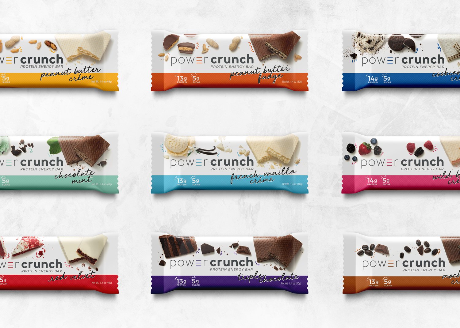
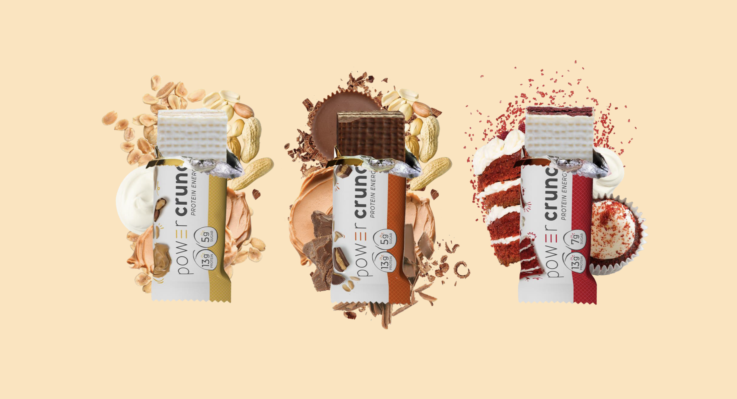
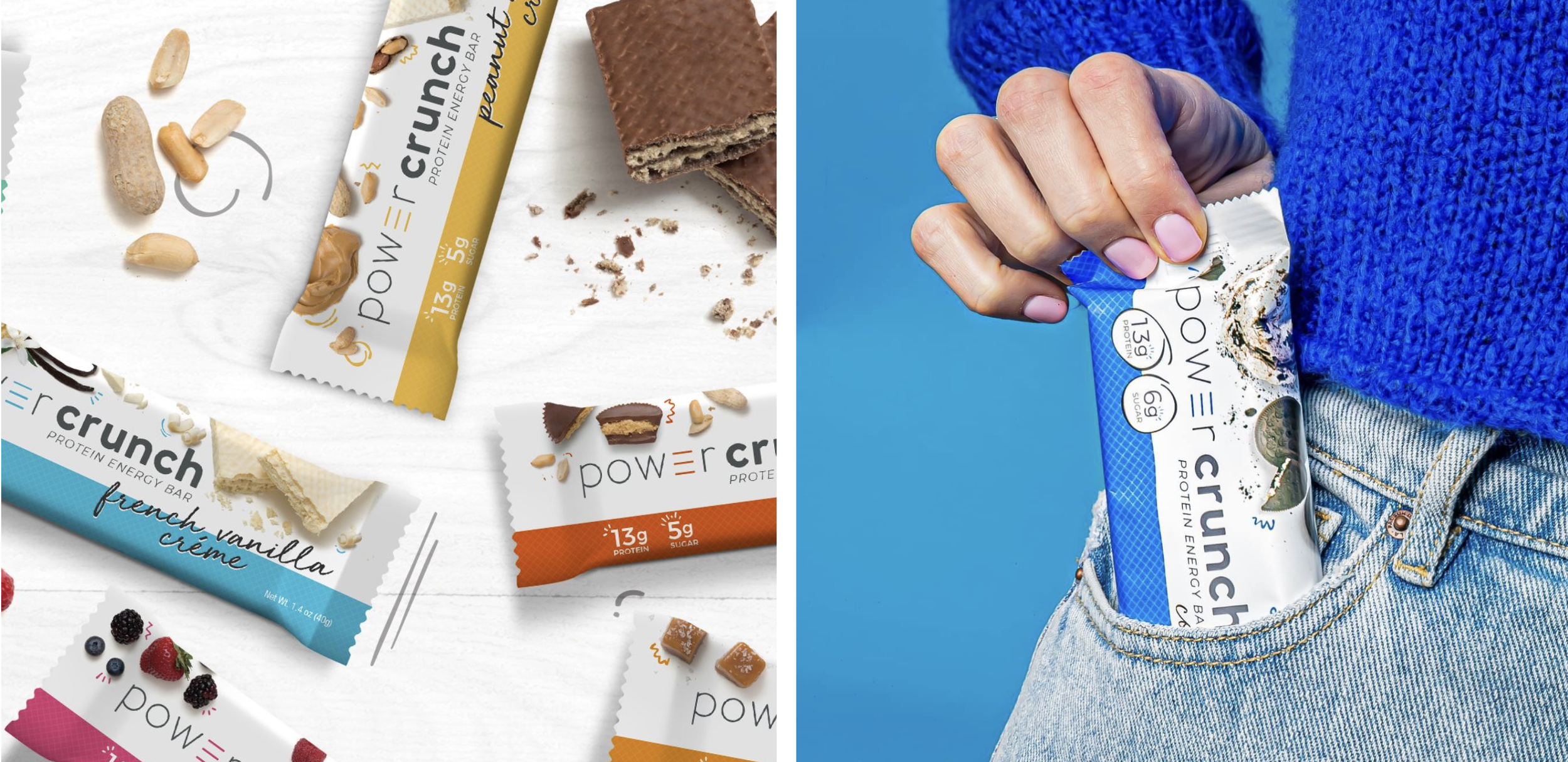
Updating everything from brand language, logo, packaging design and photography styling myself and the team at Clever Creative ultimately positioned Power Crunch for new retail exposure and success.
ROLE
Brand Identity Refresh, Photography Direction, Packaging, Style Guide
CREDITS
Agency: Clever Creative
Creative Director: Amy Wilk
Art Director: Emily Zarnow
Designer(s): Emily Zarnow

Simplified Style
We streamlined and modernized the Power Crunch logo to create a bold, friendly mark that feels both clean and approachable. At its core is the distinctive “e,” inspired by the brand’s signature wafer layers—an elevated element that stands out on its own as an iconic symbol of the brand’s identity.


Set Up For Success
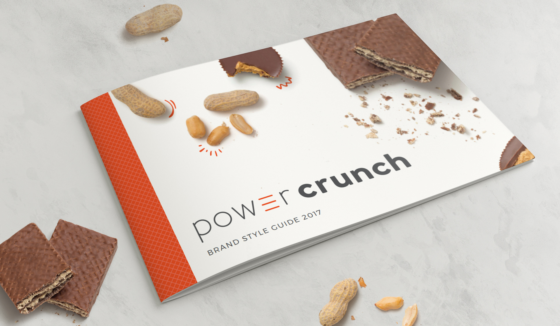
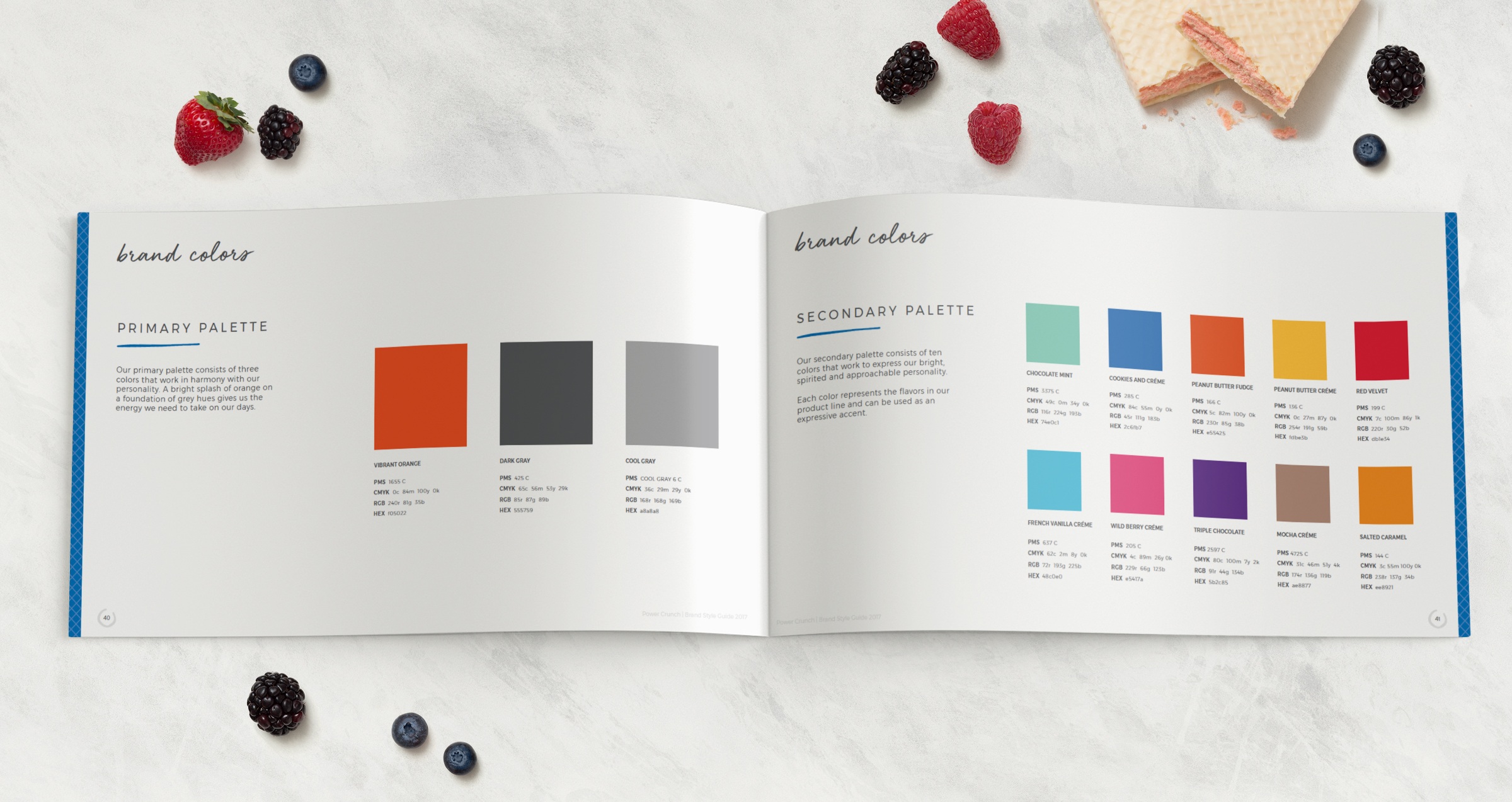
Though technically a “refresh,” the design updates brought new energy to the Power Crunch brand, elevating its presence both digitally and on shelf. By delivering a comprehensive style guide covering brand positioning, tone of voice, photo direction, graphic assets, and packaging anatomy we equipped the Power Crunch team with the tools to build lasting, cohesive success.