Power Crunch
Brand Architecture
Visual Identity
Packaging
THE OPPORTUNITY
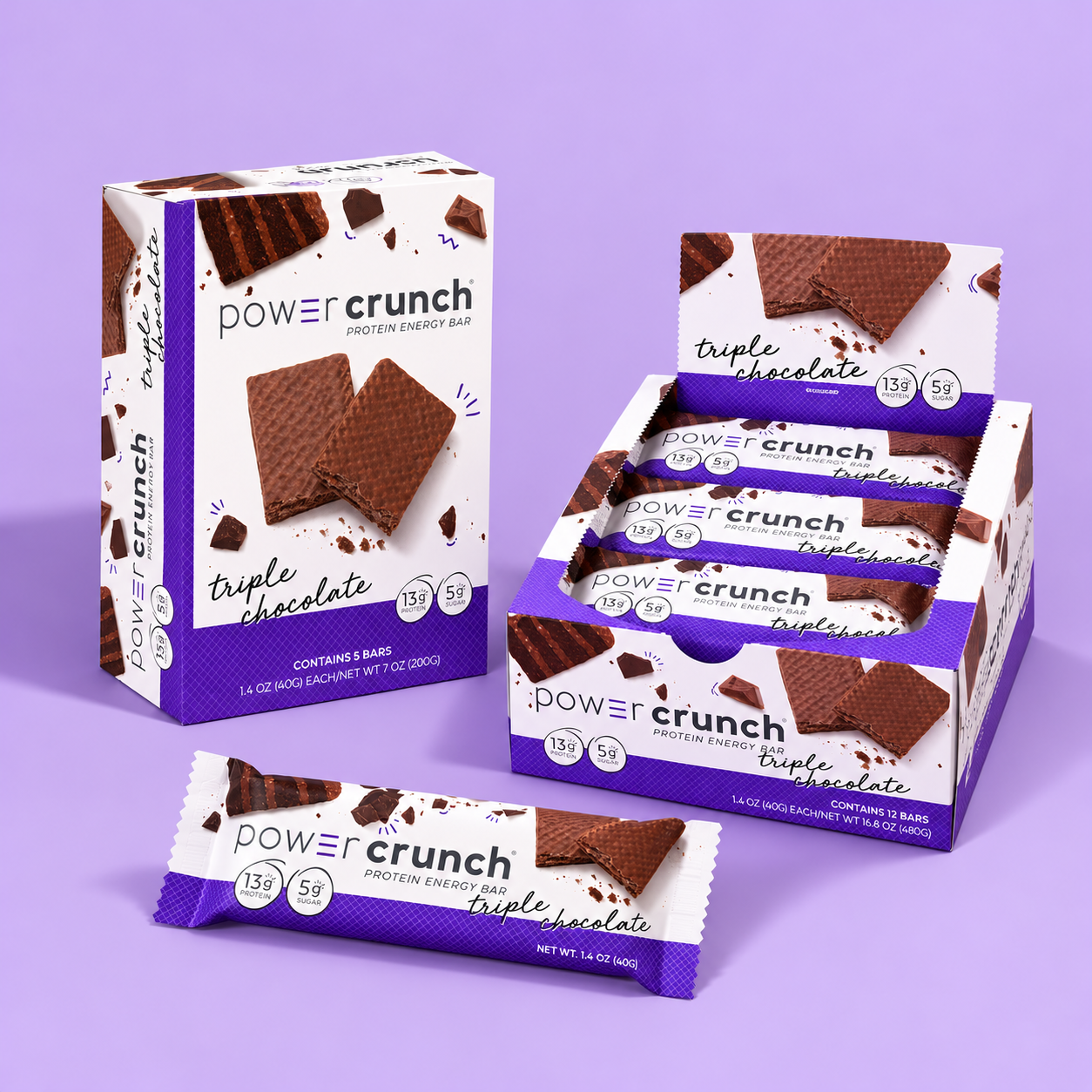
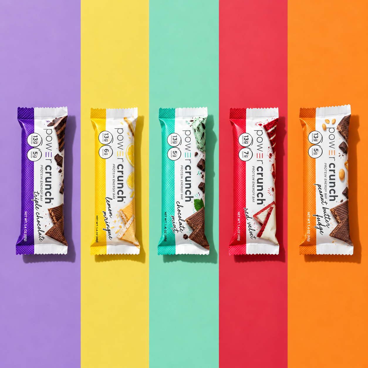
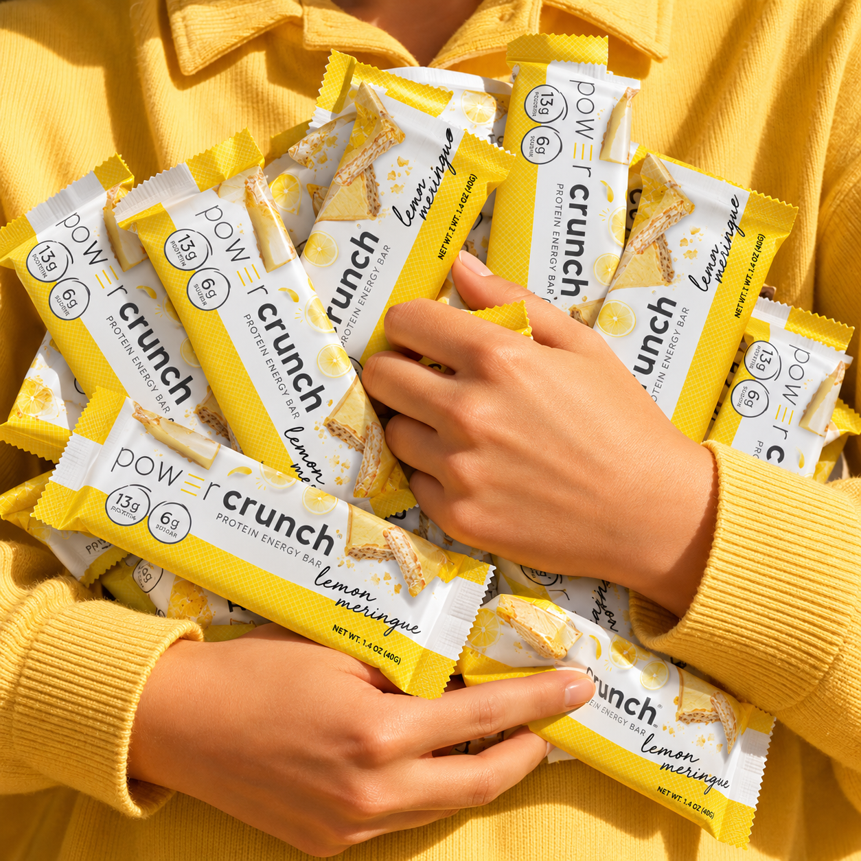
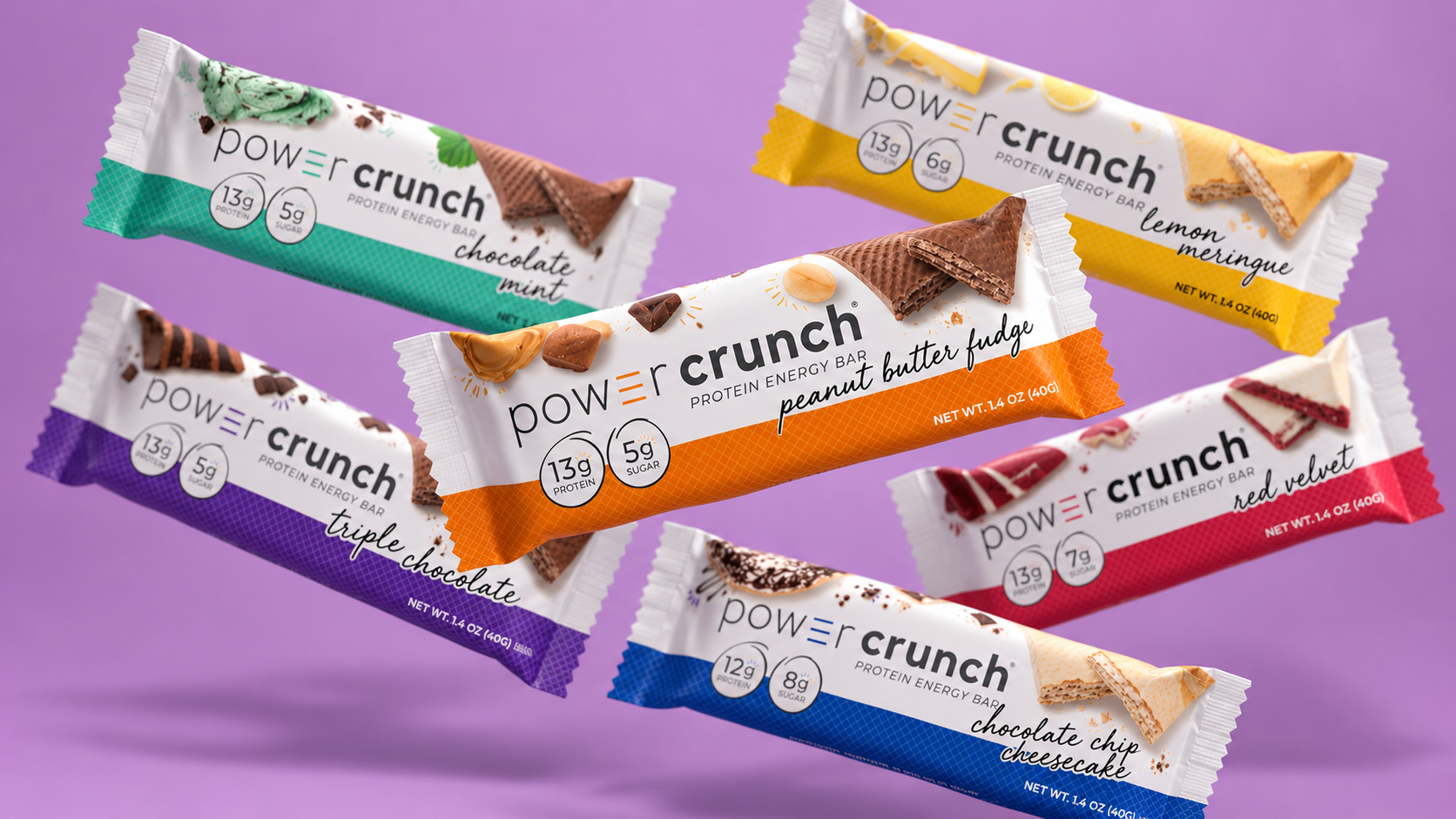
Updating everything, from brand language and logo to packaging design and photography styling, we ultimately repositioned Power Crunch for new retail exposure and long‑term success.
CREDITS
Agency: Clever Creative
Creative Director: Amy Wilk
Art Director: Emily Zarnow
Designer(s): Emily Zarnow
Building a Bolder Identity
BEFORE
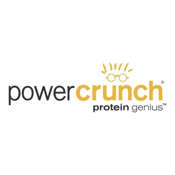
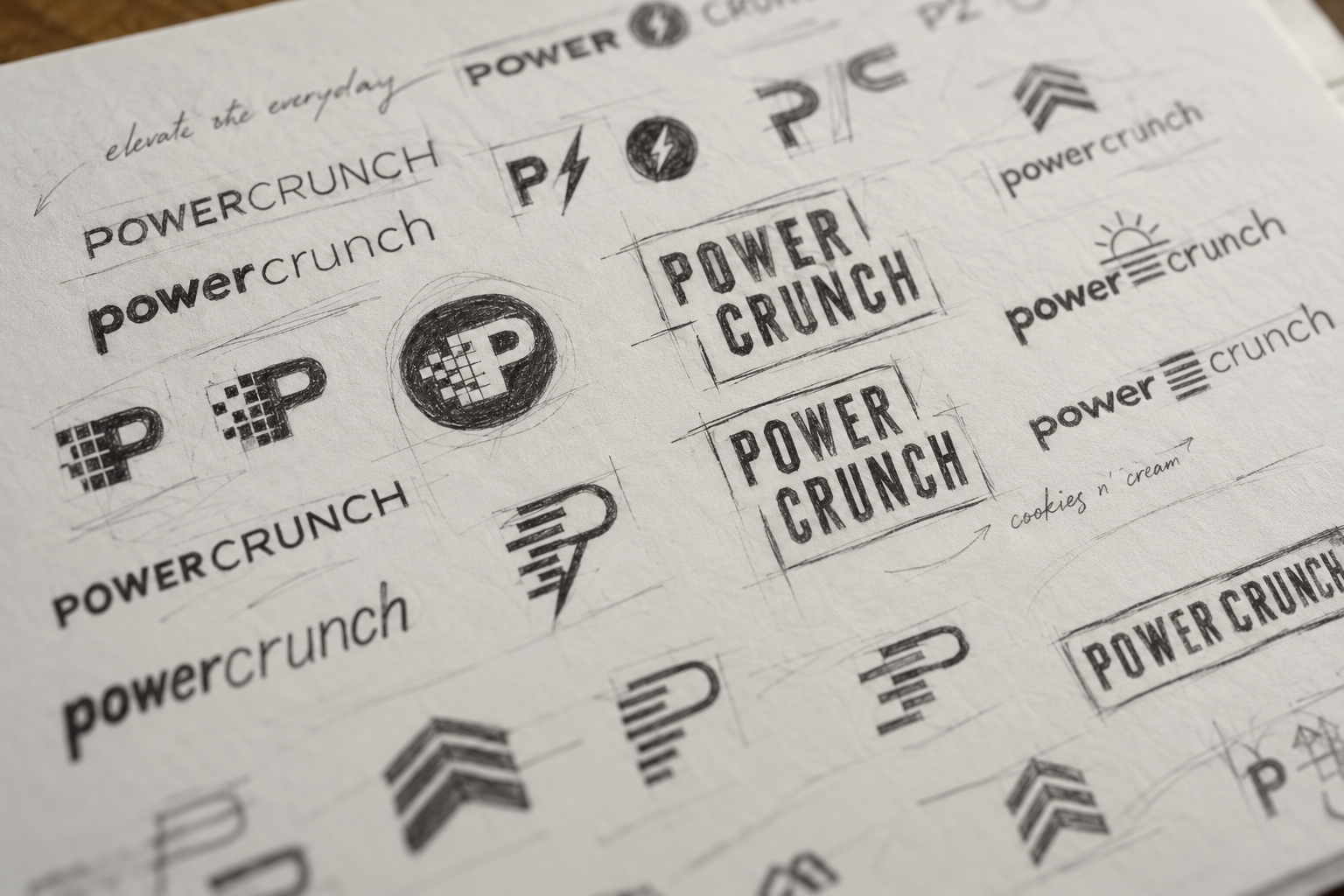
The identity development began with an exploration of typography, form, and personality. Through a series of early concepts and refinements, we worked toward a visual language that felt distinctive, energetic, and unmistakably Power Crunch.
AFTER
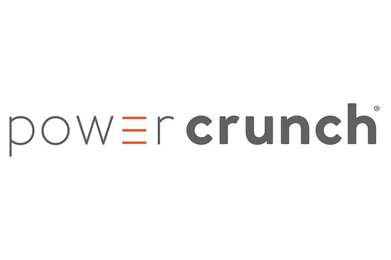
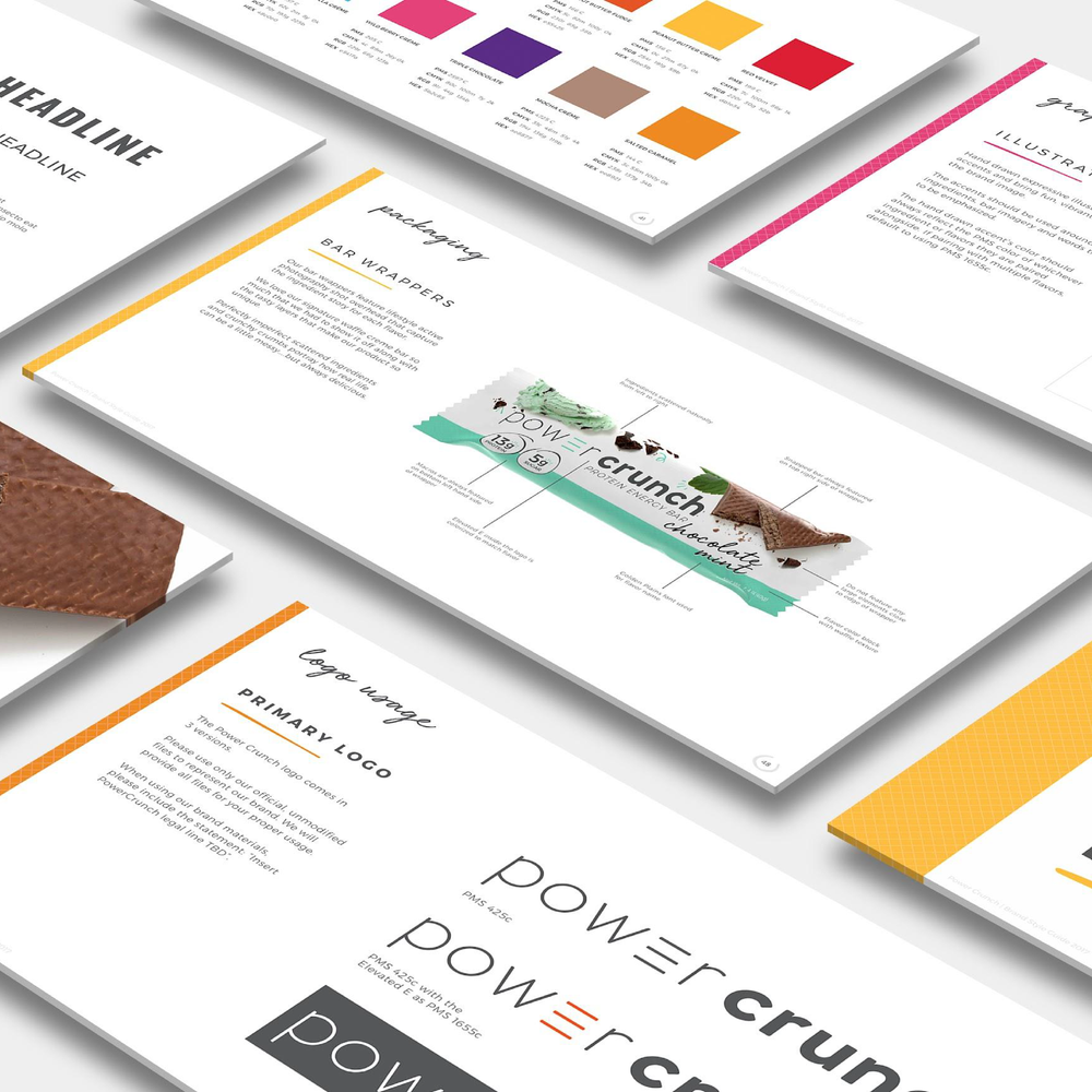
Inspired by the signature crispy wafer layers that make Power Crunch unique, the redesigned logo introduces an unexpected detail: an elevated “e” in Power. A subtle nod to the product itself, the letterform also doubles as a power symbol, bringing a little extra meaning (and personality) to the brand’s identity.
Packaging Headline Here
Inspired by the signature crispy wafer layers that make Power Crunch unique, the redesigned logo introduces an unexpected detail: an elevated “e” in Power. A subtle nod to the product itself, the letterform also doubles as a power symbol, bringing a little extra meaning (and personality) to the brand’s identity.