PROPR
Naming
Visual Identity
Packaging
Web Design
THE OPPORTUNITY
Build an innovative cleaning mitt brand from the ground up, creating a cohesive identity that felt clean, refined, and approachable. From naming and visual identity to digital design, every element was thoughtfully developed to establish a distinctive presence rooted in simplicity, functionality, and modern sophistication.
CREDITS
Creative Director: Emily Zarnow
Brand Strategy + Naming: Emily Zarnow
Design: Emily Zarnow
A Study in Simplicity
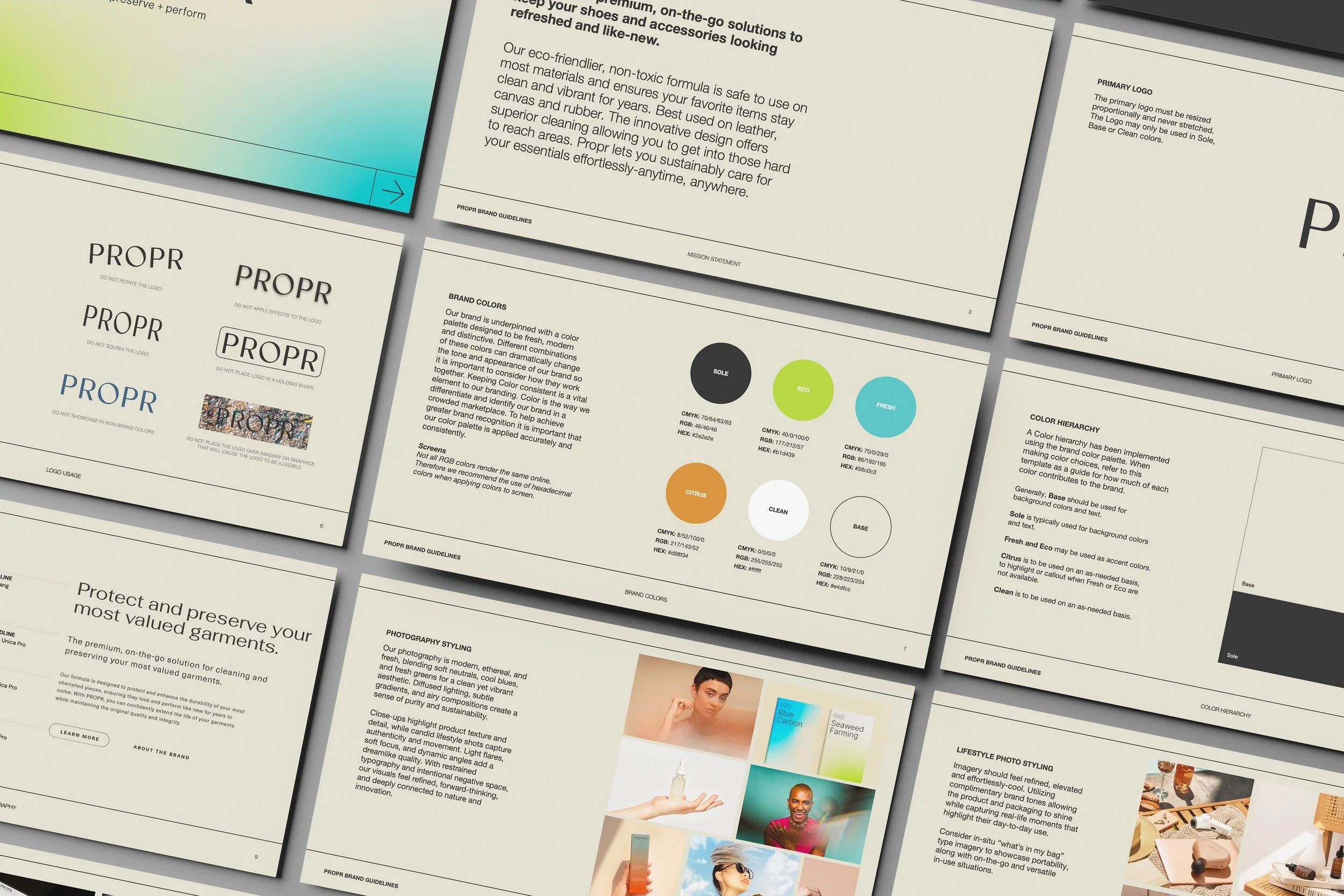
From naming to visual identity, the goal was to create a brand that felt refined, modern, and effortlessly simple.
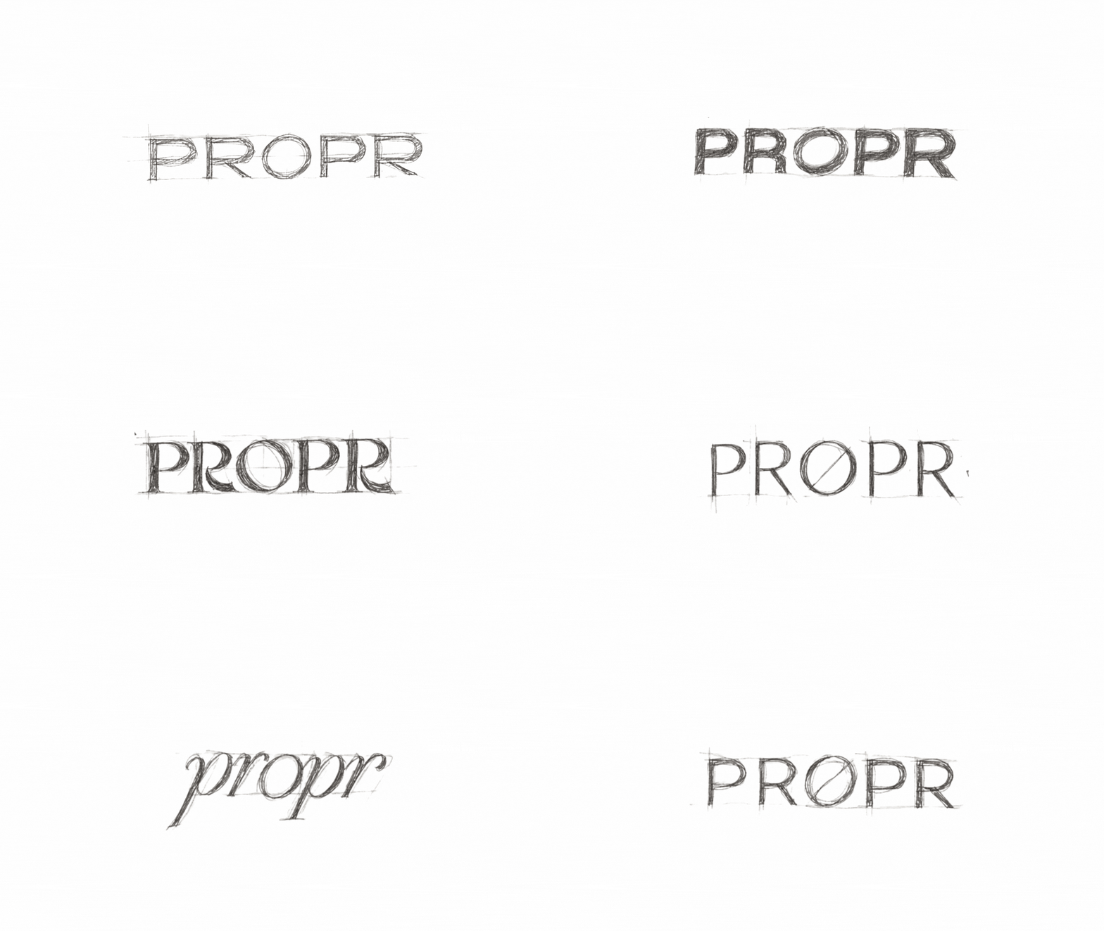
The name PROPR was inspired by a clever double meaning: propre, the French word for “clean,” and proper, an English word suggesting something polished and put together.
This thinking carried through to the identity itself, where explorations in typography and form helped shape a visual language that feels minimal, intentional, and distinctly its own.
Thoughtfully Packaged.
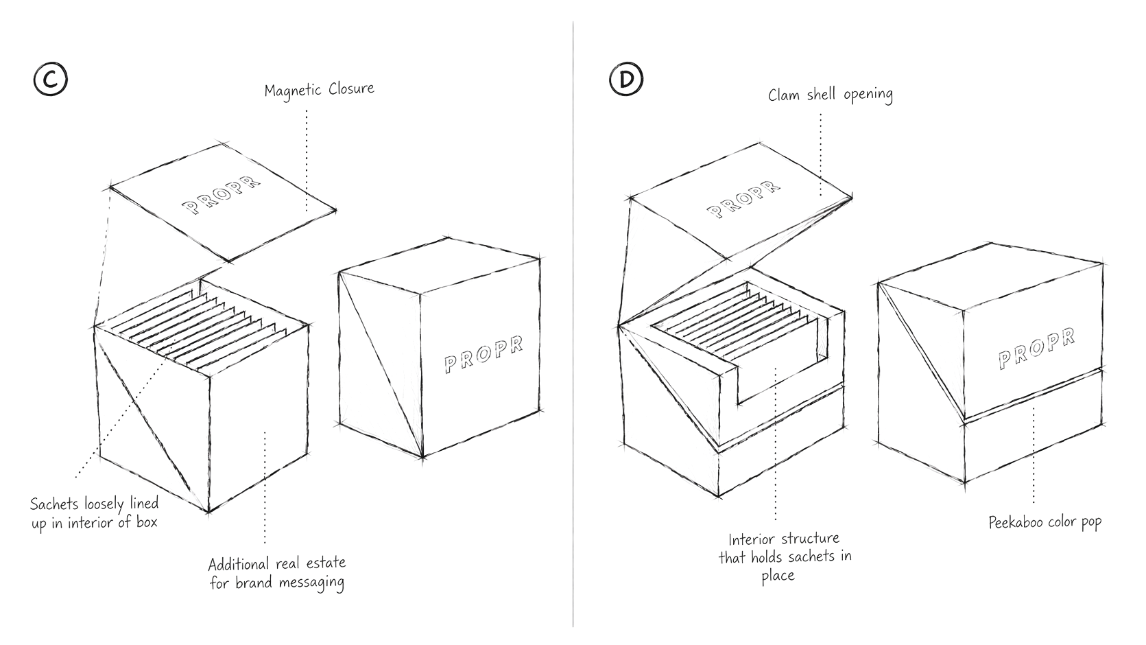
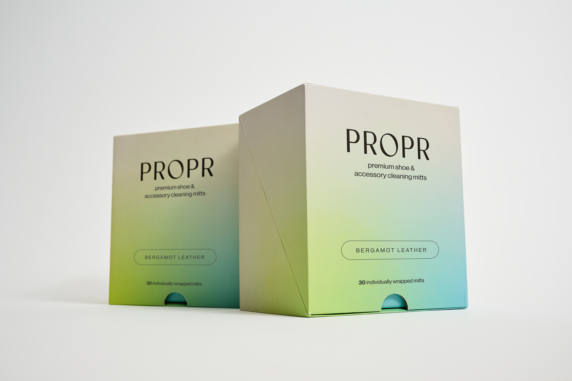
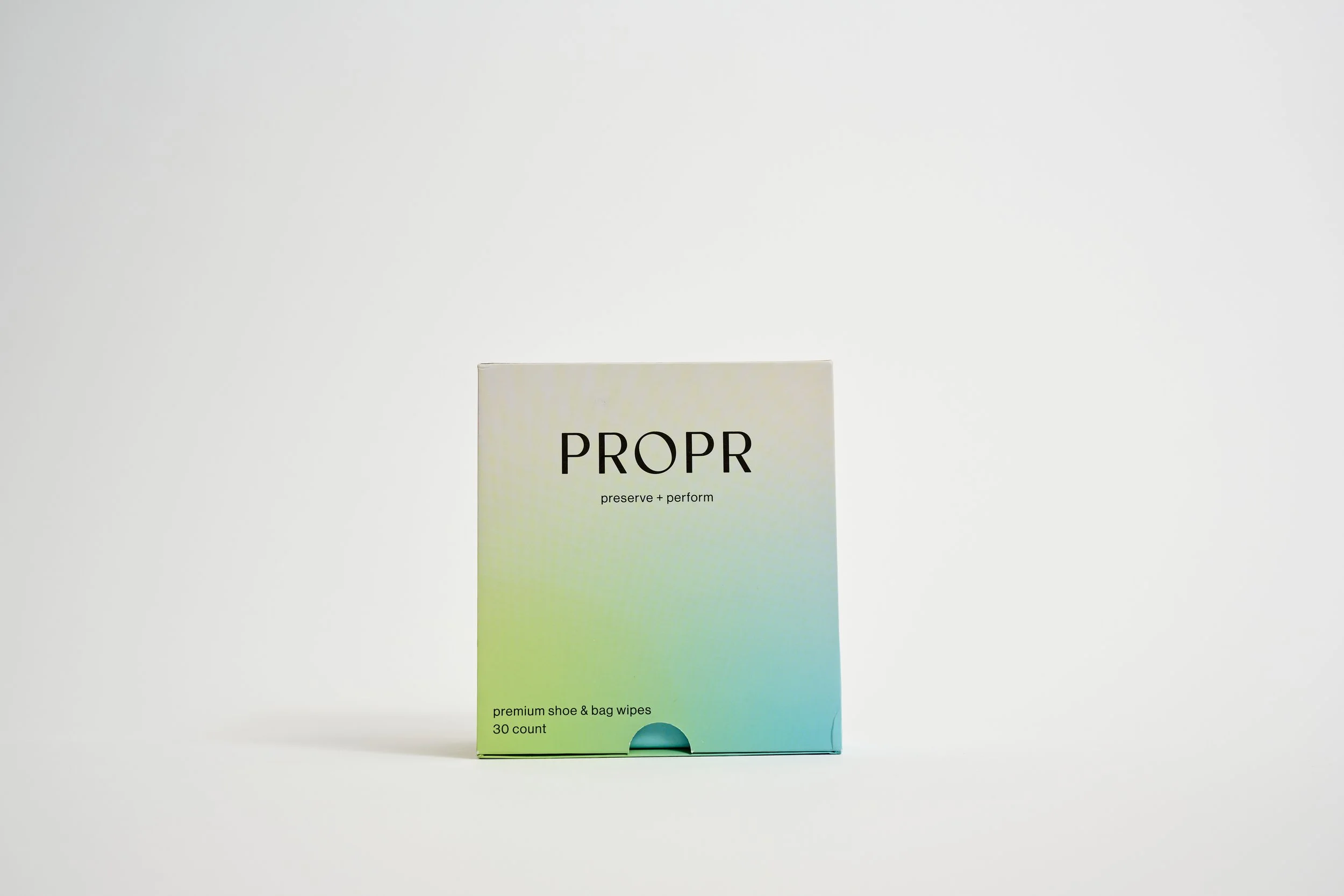
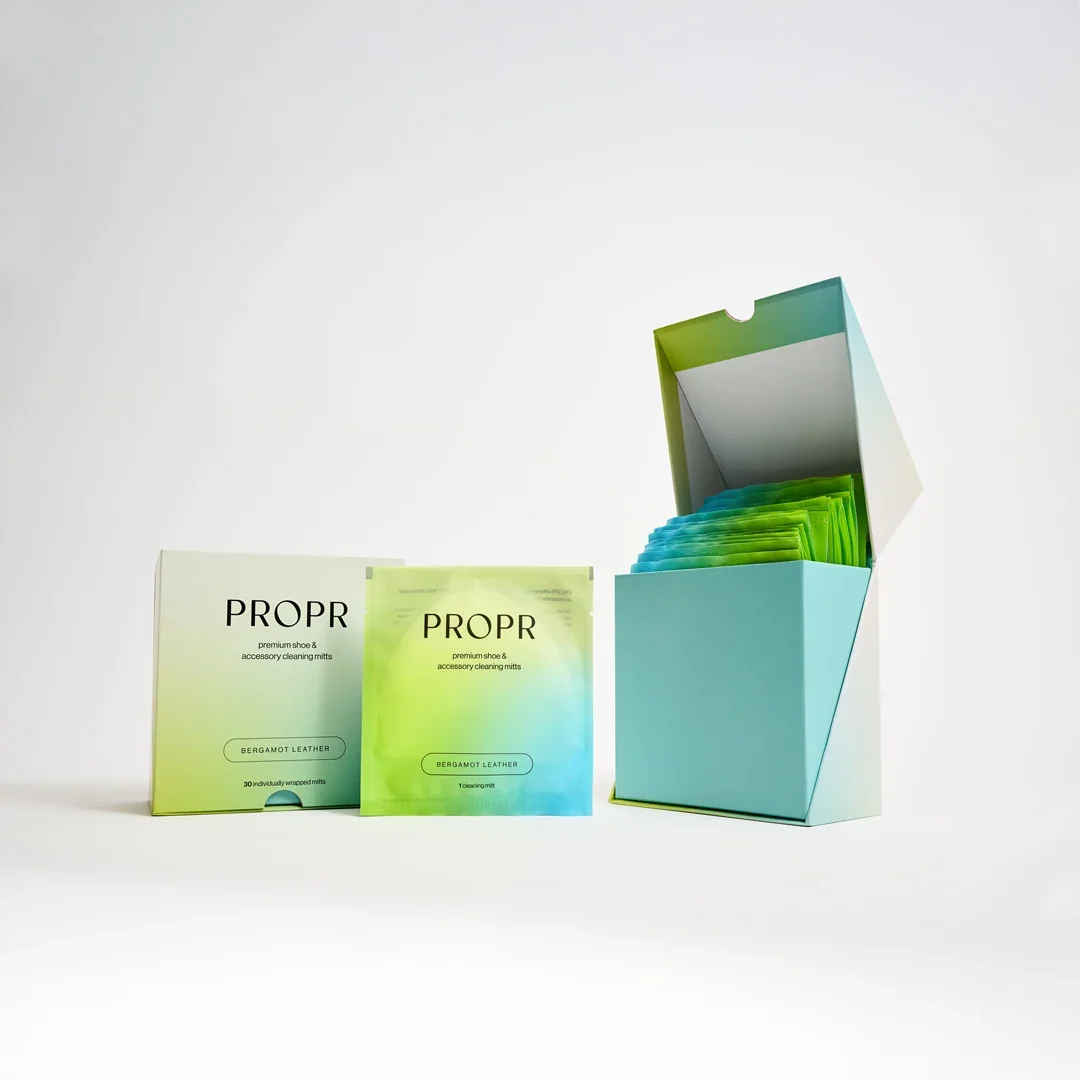
Designed to be more than just packaging, the custom box brings together form, function, and thoughtful details. Working closely with a manufacturer, I developed an elevated, reusable storage solution that keeps daily sachets neatly organized while extending PROPR's refined visual identity into an everyday experience. A design intended to be kept, not discarded.